Print Examples
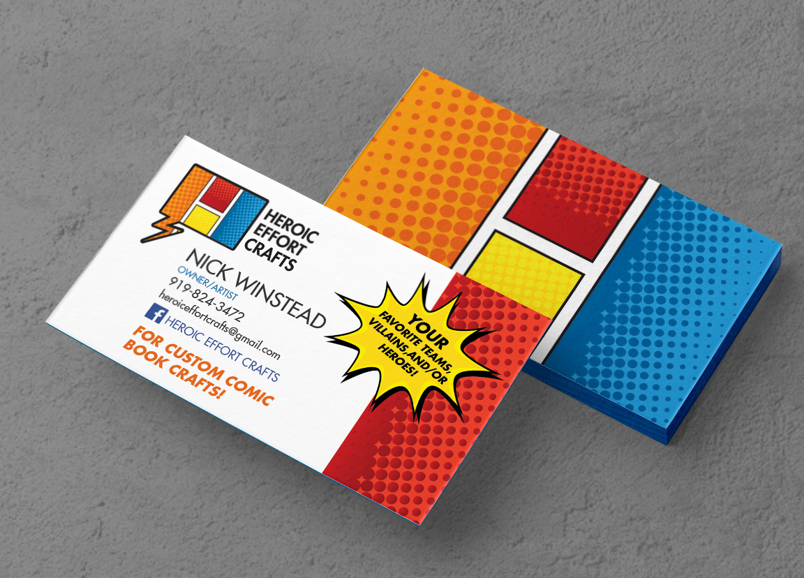
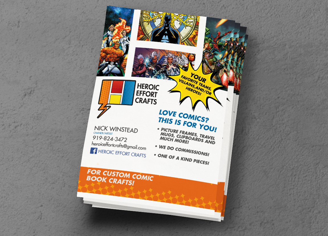
I wanted to use the vernacular of the comic book medium to inform my design. I created a business card that was playful but emphasized organization and efficiency. On the back of the business card I used the negative space between stylized comic book panels to create the letter H and further brands design vocabulary. The final product was a business card that is instantly recognizable and memorable.
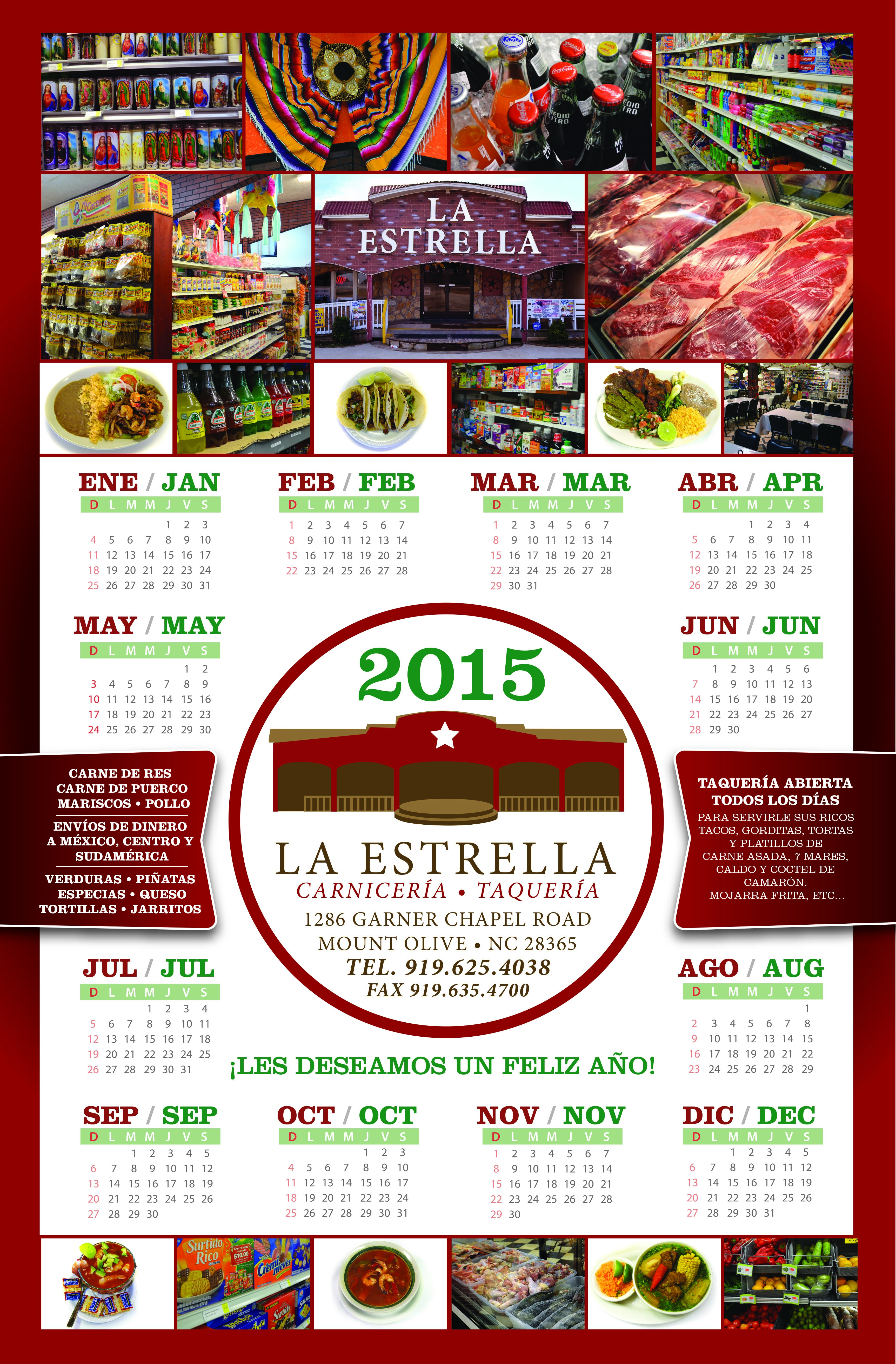
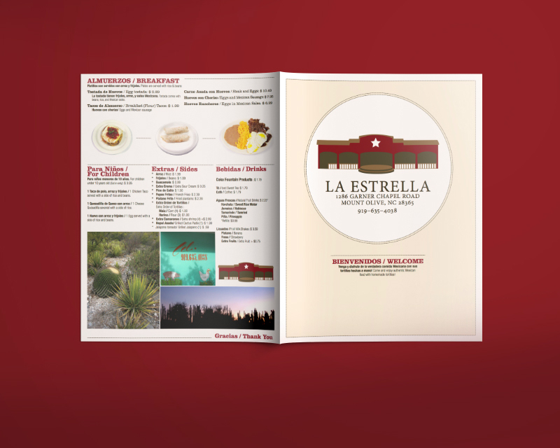 La_Estrella_Menu_Back
 La_Estrella_Menu_inside


